
Savannah Ultimate
Logo and brand design for a non-profit ultimate frisbee organization located in Savannah, GA.
Logo and brand design for a non-profit ultimate frisbee organization located in Savannah, GA.
Savannah Ultimate Project (now Savannah Ultimate) was officially established in 2020. In pursuit of sounding and looking more legitimate they removed "Project" from the name and sought professional branding comparable to and competitive with other popular frisbee teams and organizations.
Considerations
The community is known for their ability to maintain organized play while still being inclusive and educational to new players. It was important that I design a logo and brand that felt professional and competitive without intimidating and deterring potential new players. I also took into consideration Savannah's climate and geographic characteristics.
Client
Savannah Ultimate
Role
Designer
Design Solutions
Brand & Logo
Merchandise
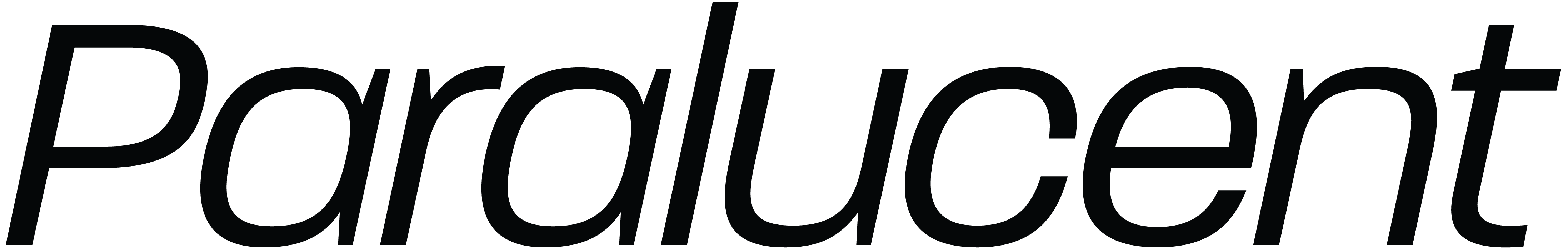
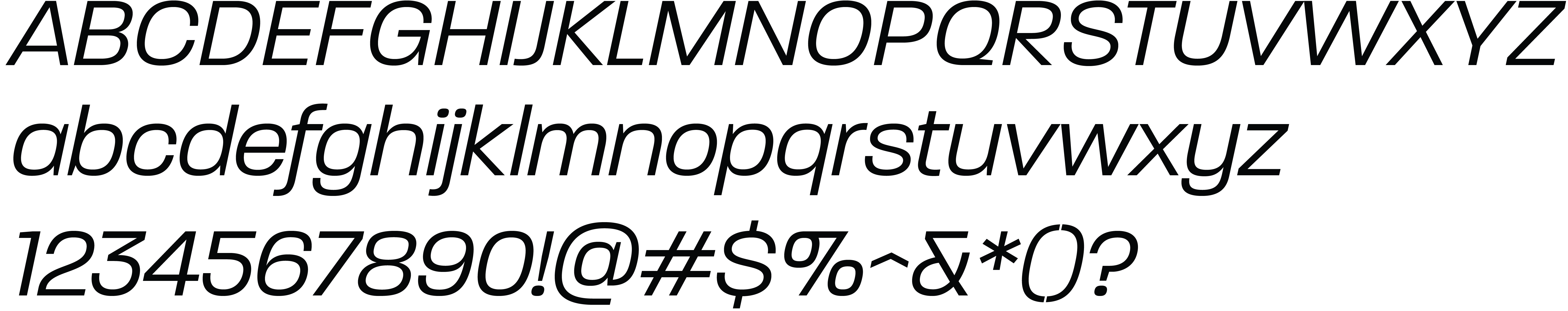
This logo hinged largely on the typeface selection, Paralucent. It's slight boxiness added the perfect touch of sturdiness and its italic style, along with the active disc, brought energy and movement.
Paralucent is a multi-purpose workhorse, flexible to any use case and successful in all capacities: logo, headline, and copy. It's clean and direct while still feeling friendly.
For color I played into characteristics of Savannah, and through primary(ish) colors, themes of education, fundamentals, and universality.
Pollen
Sun
Clay
Sea & Sky
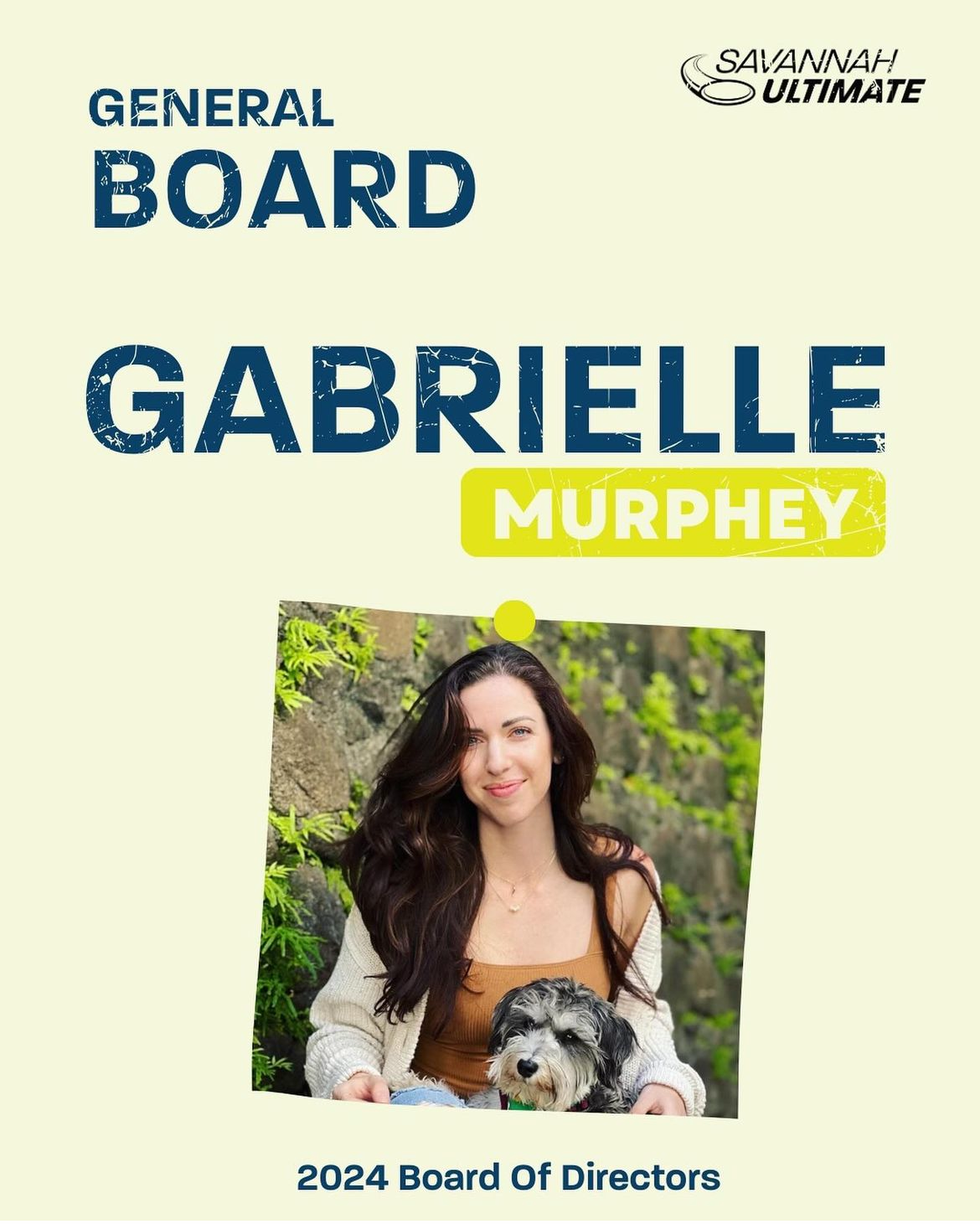
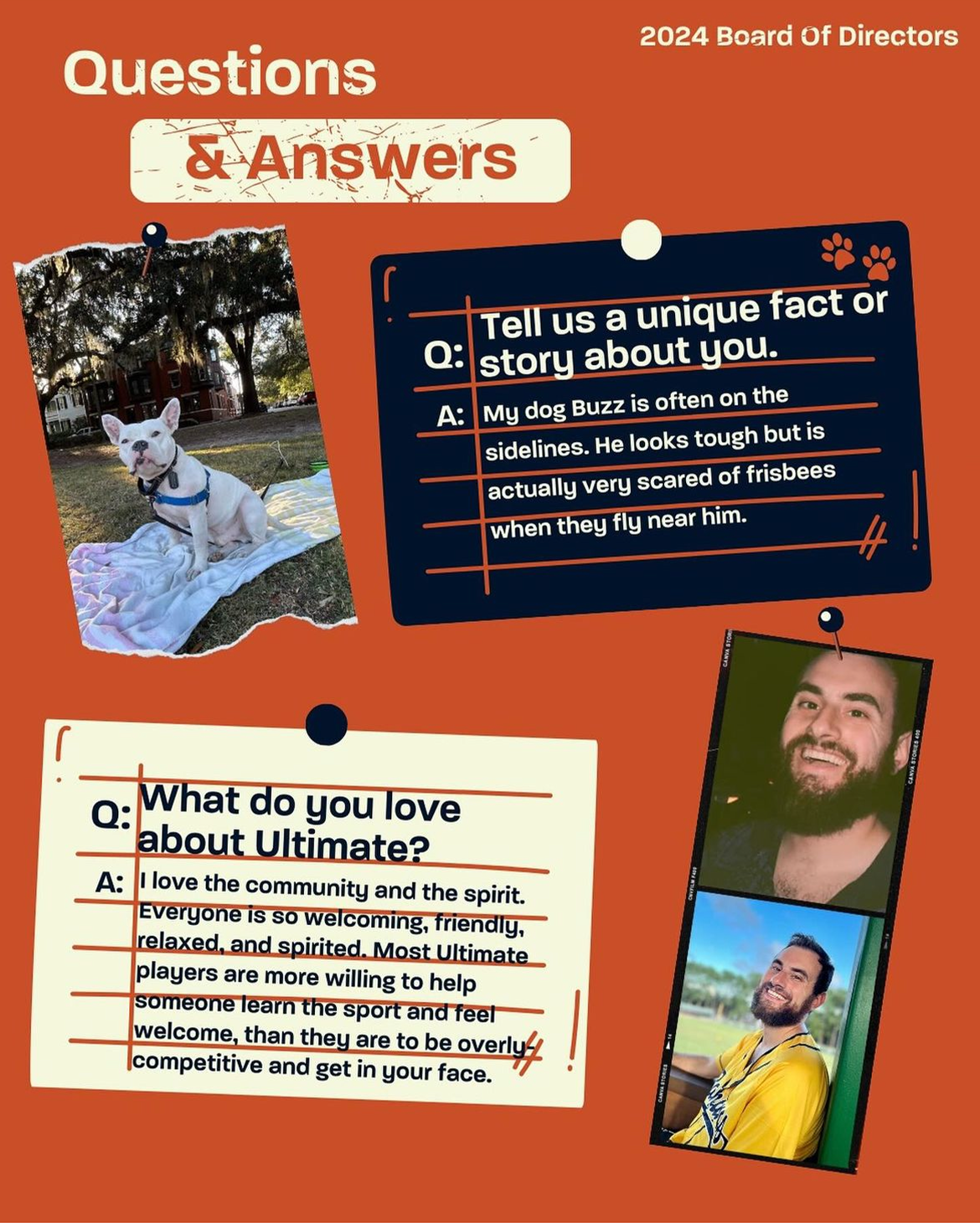
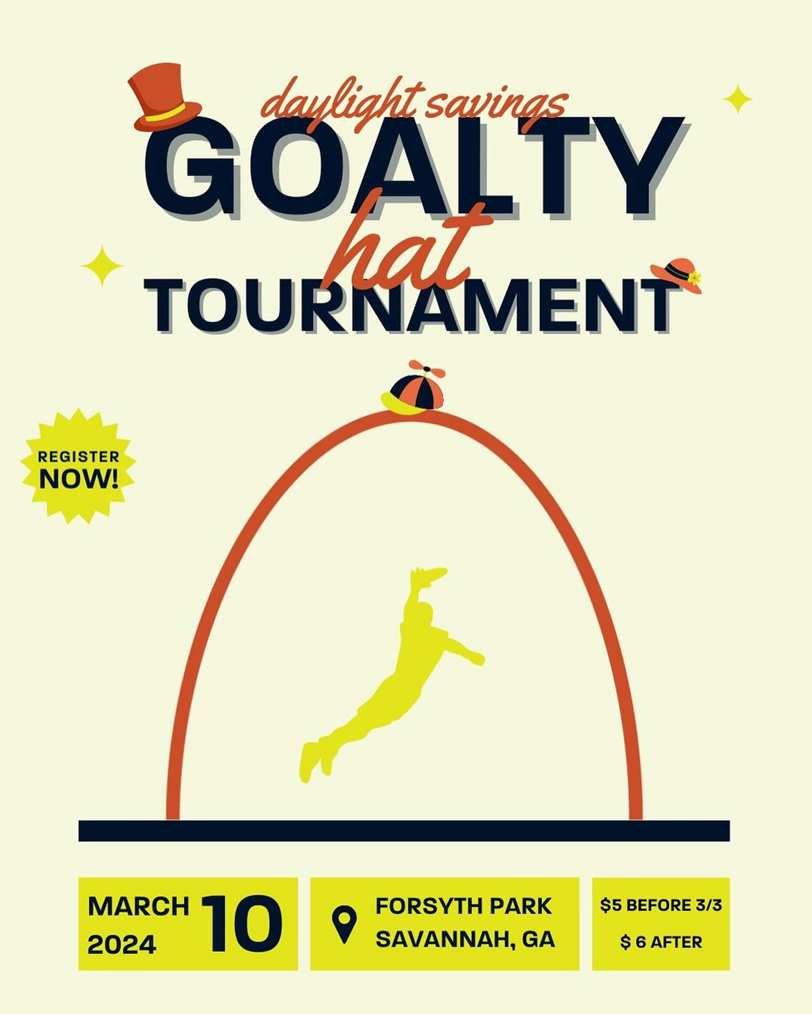
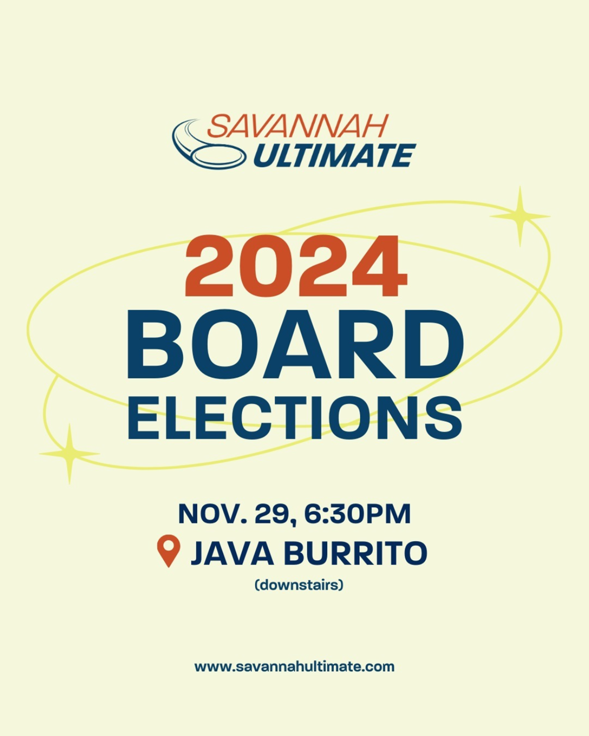
Savannah Ultimate relies on volunteers to run its organization, with that said, there isn't always a professional designer available to create assets. My goal was to use colors that worked together, no matter the combination, and a typeface that worked both as a headline and as body copy. The below social posts were created by Savannah Ultimate implementing the new brand.
This design was initially proposed as a second direction to the above logo. Although the board felt the logo above was more appropriate for the overall brand, they still liked this design, and felt it would work successfully for merch. The design includes a mossy oak that quintessentially represents Savannah, GA. The design is also an evolution from the organization's previous logo.