Dioptra
Logo and brand design for International Rescue Committee's new data collection tool.
Logo and brand design for International Rescue Committee's new data collection tool.
Dioptra is a tool created by the International Rescue Committee (IRC) for the purpose of collecting and organizing comparative data to help the financial efficiency and effectiveness of humanitarian efforts.
Considerations
The logo and brand needed to strike a balance between seriousness and approachability, as well as appear data driven without seeming too tech.
Client
International Rescue Committee
Role
Designer
Design Solutions
Logo & Brand
Icon
Motion Media
The name "Dioptra" was chosen by IRC, and is representative of the revolutionary data collection tool used for measuring stars and surveying land. Inspired by the tool itself, this logo captures the tool's naturally occurring "D" shape and uses letterforms consistent with measurements you'd see collected by this tool.
Primary Logo
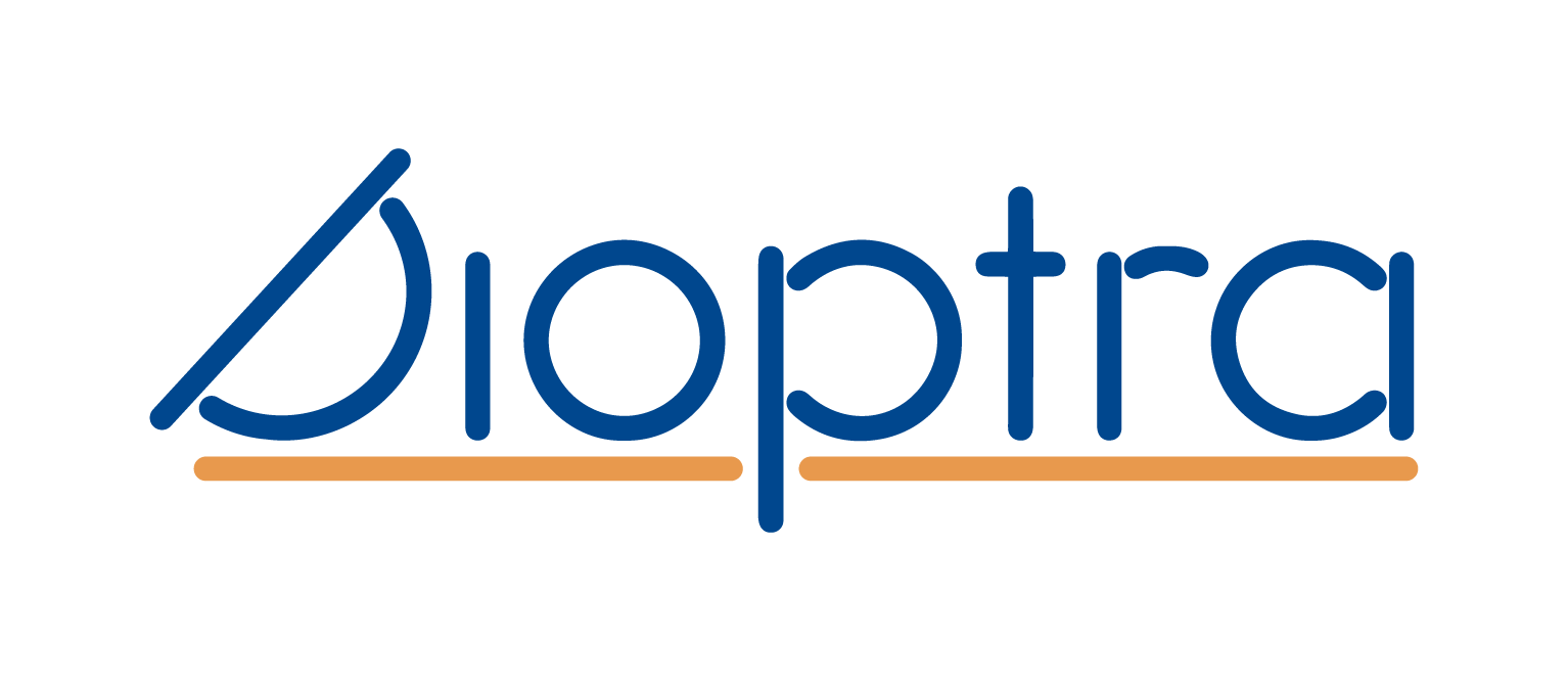
Logo Mark

Image of Dioptra Tool

Primary Typeface
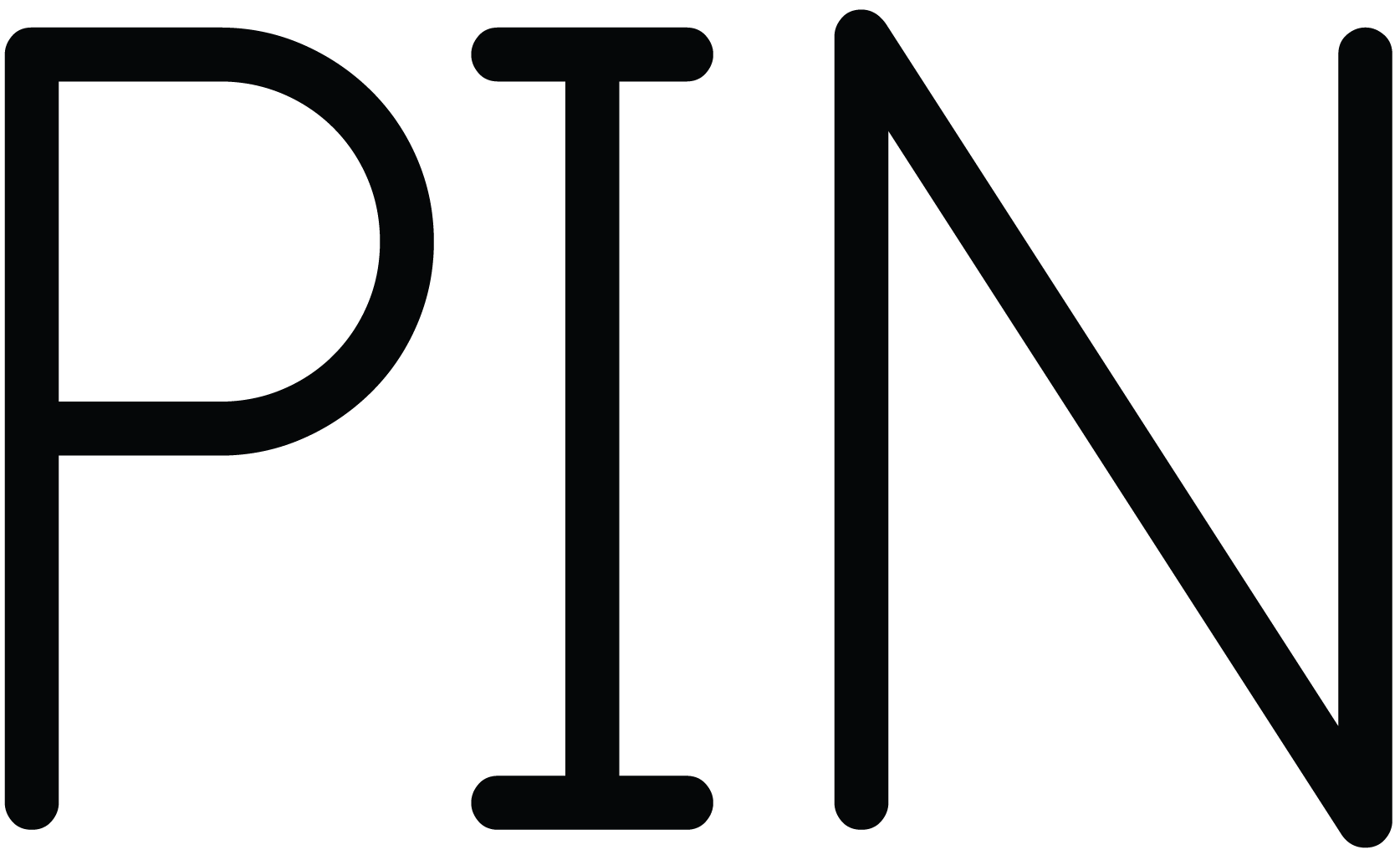
PIN (rounded) was chosen for its monoline nature, reflecting technical drawings collected by the traditional dioptra tool. PIN's rounded typestyle was selected to iterate the ease and accessibility of the organization's tool.
Secondary Typeface
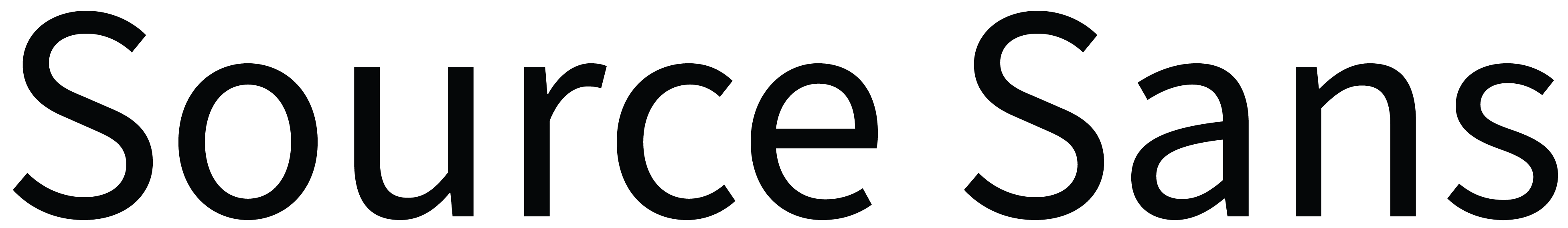
Characterized by its clarity and legibility, Source Sans is well-suited for user interfaces and long-form text. Inspired by American gothic typefaces, it balances clarity with a touch of humanist influence.
Rich in color and optimistic in tone, this palette reflects the vibrant communities IRC serves. The palette works harmoniously with the organization's photography, which I believe to be their most impactful marketing asset.
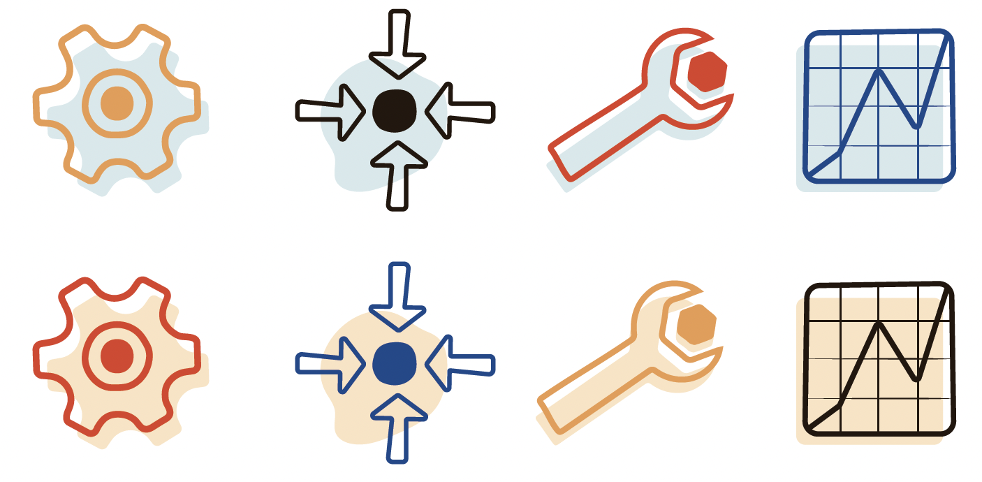
The icons have a hand-drawn appearance making them feel organic, humanistic, and unique. Although not a part of the project's original scope, icons were ultimately needed for the tool's website—I included them as a way to further support the new visual identity.